
LION Engineering, the British behemoth in heavy industry, has excelled in hardfacing and machining for over 50 years. However, it remained a puzzle for the locals. Or even worse – a company associated with rugged working conditions. Despite its efforts to modernize and explore new sectors, attracting quality employees proved to be a challenge. This started to impact the pursuit of modernization and expansion into new business areas.

At the eleventh hour, we prescribed LION a complete BPM solution:
Rejuvenate the brand
Realign the company values
Grab attention in the online space
Write "the king of industry" into the brand's DNA
Through a series of intensive workshops, we delved into the heart of the challenge and began transforming the solitary lion into a wise ruler. We crafted an ingenious guide for the company, ushering it on the repositioning journey.
While crafting the brand's visual identity, our aim went beyond mere stylishness. We forged an identity that infuses the LION team with a fresh surge of motivation.




We have crafted a modern and minimalist logo with a triple meaning:
One of the core ideas behind the new identity was to stand out from the rest of the market.
The new duo of mint green (= environmentally friendly approach) and kerosene (= heavy industry and metals) stands out amidst a sea of blue tones that most companies in the industry have adopted.


Relics of the ruler archetype


Symbol of combativeness and courage


Pattern of hardfacing

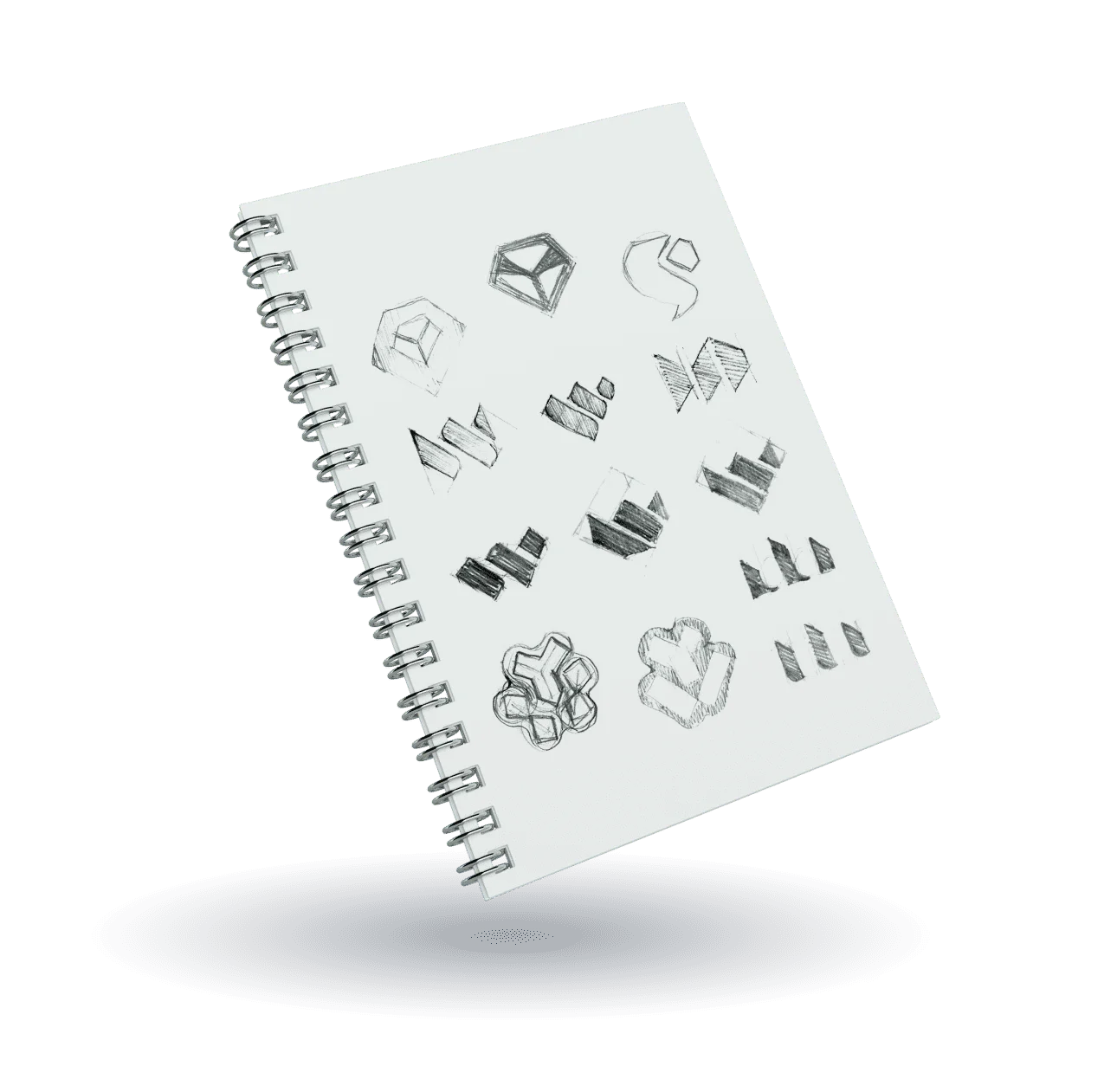
The creative process began with pencil and paper. There we found the perfect shape for the new logo.



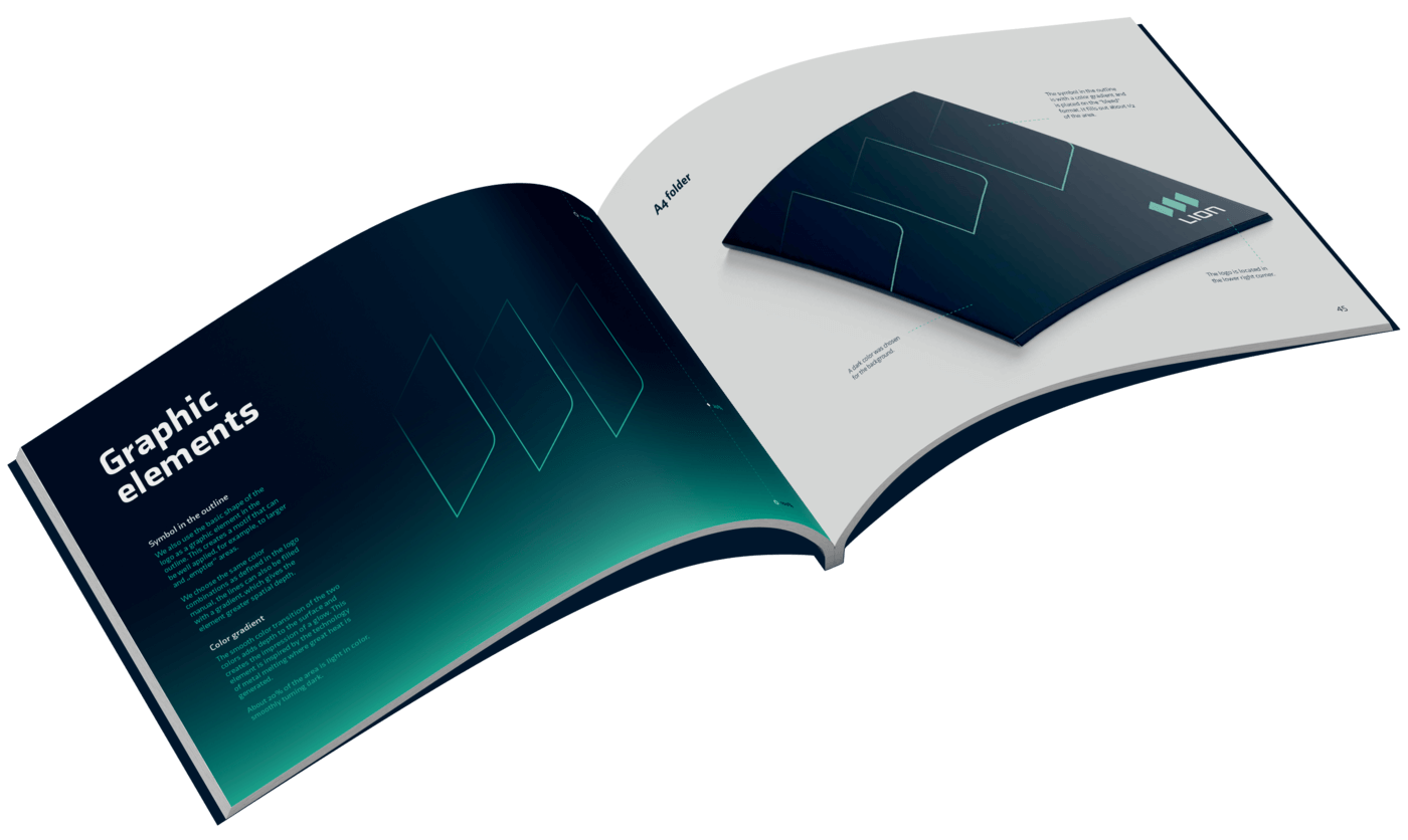
The output includes a Brandbook containing Core Manual and Design Manual, which defines the usage of the entire brand.


work clothes
Then we dressed LION in a new coat from head to toe. Quite literally. Because if we intend to exude kingship, our appearance must reflect it as well. We crafted a complete merchandise set and designs for both online and offline advertising.

safety helmet
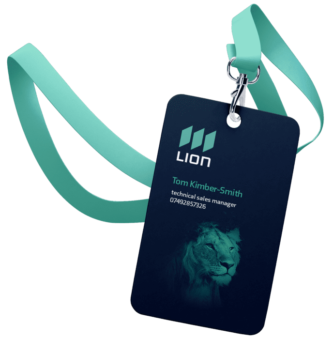

bottle
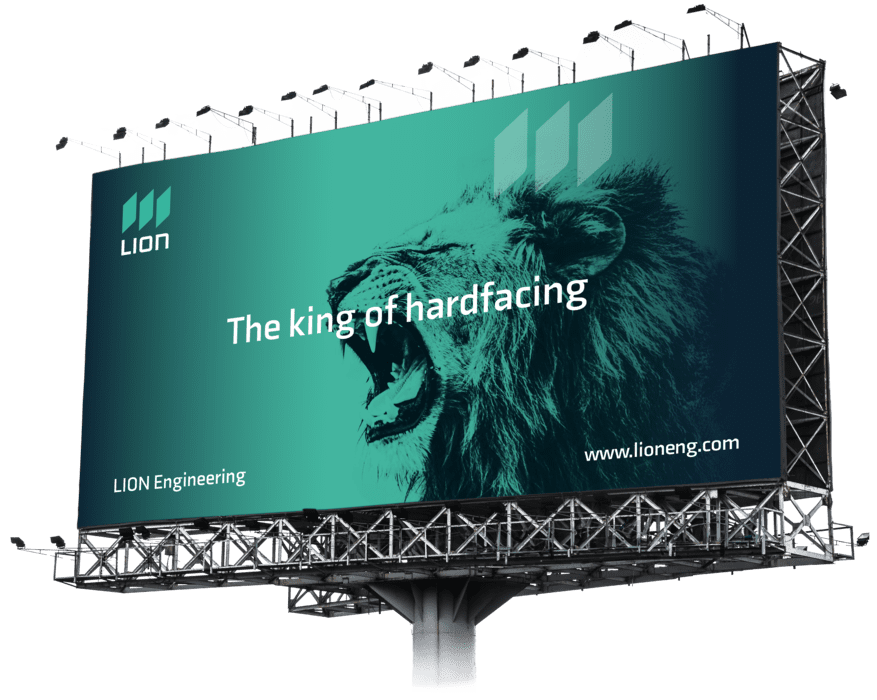
billboard
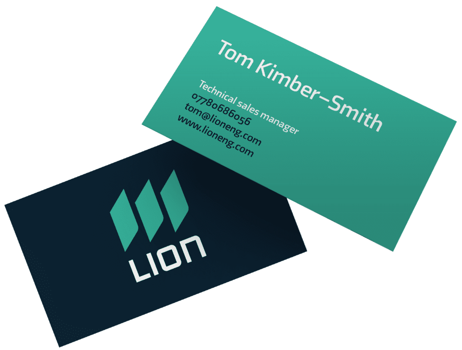
business card
The icing on the cake, and the definition of a brand essence, is the new claim: "Reshaping the world."
This statement perfectly encapsulates the company's vision – signifying a fresh start, extension beyond heavy industry, and cultivation of a growing global network of business contacts.
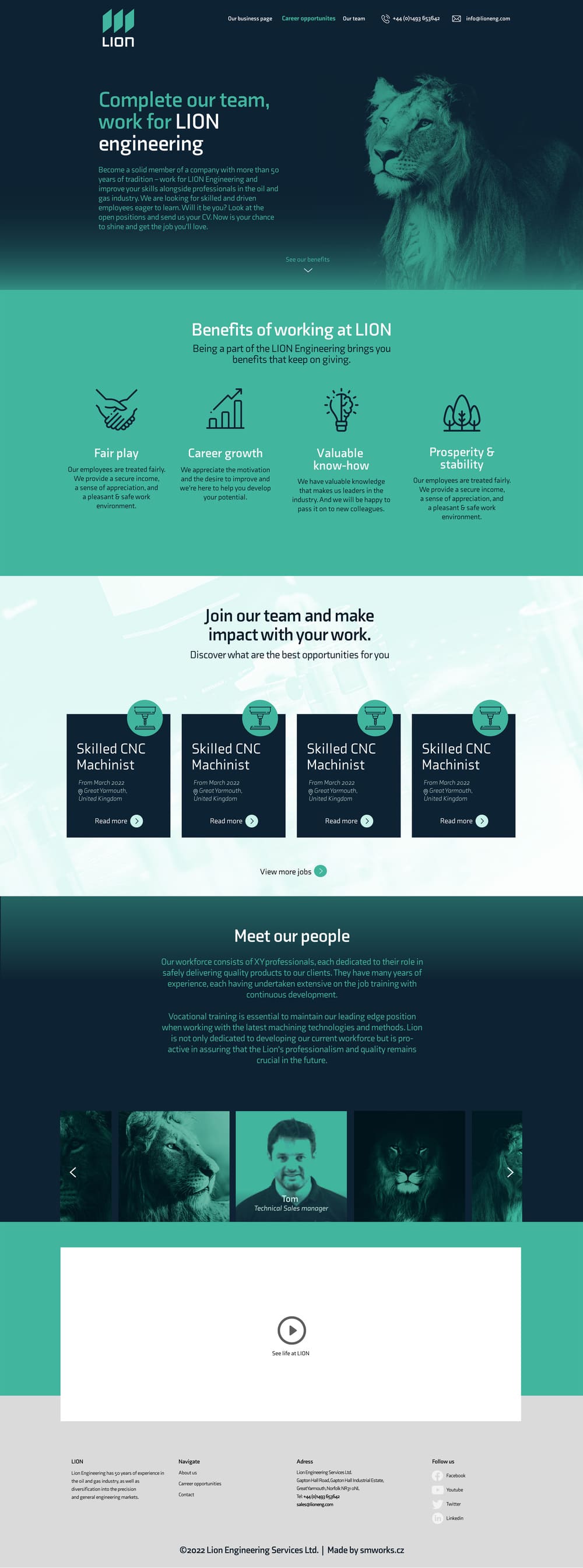
Following the branding process, we knew LION urgently needed a proper career portal. We don't do things halfway, so we initially crafted a landing page featuring available positions. Only then did we embark on a comprehensive overhaul of the official website. Within it, we seamlessly integrated the HR landing page. The result is a stunning & user-friendly site adorned with the new visual identity, serving as a dignified representation of the brand's new face.
We didn't hesitate to make our mark on social media either. Profiles on Twitter, Facebook, and LinkedIn underwent a makeover, both visually and content-wise. The goal of our new content strategy was to put LION on the radar of a wider region, bolster brand awareness, and present the company in a new light.
In addition to page-like campaigns, we delved into the HR area. With the company in constant growth, we launched recruitment advertisements, offering a helping hand to fulfill the demand for capable team members.


"Our employees have fully embraced the change, we've even received positive feedback from customers. So yes, I like it very much. And not only because of how the rebranding looks, but also due to the results it's yielding. To achieve such outcomes, you need to empathize with individuals in the company and get under their skin. And you've done just that."

Geoff Kimber–Smith, CEO LION Engineering
 BPM project
 BPM project
 Digital marketing
 Marketing & e-shop

Want to send a no-strings inquiry?
Use our formNeed to talk to a real human?
Go to ContactCurious what we're up to and what events we're planning?
Go to Blog